Showing posts with label Design. Show all posts

How to design a good looking user friendly Blog?

Many bloggers rush through selecting their blog design elements without much thought when they first start. But the reality is design is core to your blog's brand and readership. Blog design does not require artistic training or high level skill. It requires strategic thought, target your blog's goals and target audience before start blogging.

I hate your blog design

My simple tips is, review the blog's you read frequently to become familiar with your options. Consider which blogs you like and which elements of those blogs attract your attention. Make a list of those elements you want and those that you don't want.

Here is some of my Blog design tips that you don't have to be a skilled designer to follow.

Blog layout

This includes factors like columns, sidebar, header and footer. Use simple and common layout for your Blog this will help peoples to navigate easily.

Color scheme

Which colors do you want to use on your blog? How do they render on different types of devices? Are these colors associated with your brand? Are they consistent with your offline collateral and your retail establishments? Ask your self and find out.

Font

They are the written voice of your web site and should be consistent with your brand image and comfortable for your target audience to read. Text that is difficult to read can harm your traffic building efforts.

Font size

Remember you want your readers to be able to see your text. Therefore, if people over 40 are an important segment of your target audience, use a big, easy-to-read font or provide an option to select a larger size.

Font color

It is critical to keep font color easy-on-the-eyes. Too many colors confuse and some combinations will just turn visitors off and drive them away.

Backgrounds

What colors or images do you want to use as a background on your blog? This is the stage dressing for your site. Warm colors project a human focus while cool colors are associated with technology. But you might don't want the background to attract so much attention that it distracts from your content.

Lists and block quotes

Numbered and bulleted lists are important tools for organizing and presenting content. Block quotes identify other sources of information. Style them and spice up your contents.

RSS and Email Options

Do you offer readers these choices? If so, will they receive the full text of your blog or do they need to click through and come to your site? You should add this features in your Blog.

Social sharing features

How do you want to present social media in your blog? Do you want to encourage readers to share your content? Then you should add this features in your Blog.

Mobile presentation

With increased mobile usage, does your blog render in a readable fashion on a mobile device? If not, it is a good idea to add this, especially with the increasing usage trends.

I will continue writing about Blog design so, stay tuned. I may have missed some more Important things on Blog design. Lets discuss them in comment section. Smile :).

Continue Reading »

Pure CSS Lavalamp Menu for Blogger

I think that you have already seen animated menus with the LavaLamp effect based on the jQuery plugin. Today I would like to tell and show you how to repeat same behavior, only with CSS3 without any JavaScript. I will use CSS3 transitions in our menu to animate elements.

Pure CSS lava lamp menu for Blogger

Features

 - Simple but Stylish
 - Faster loading
 - Less usage of coding
 - Auto adjust with almost every blogger templates
 - Tested and runs with every latest Browsers
 - And more...............

 So, if you are ready, let's start.

DEMO

Add This Menu To Blogger

To add this Menu to your blogger blog follow below steps:
1. Go to Blogger Dashboard > Layout > Add a HTML/Javascript widget
2. Change the links and titles as your need and paste the below codes, Save and Drag the widget right below the header.

<style type="text/css">
.nav {
margin:auto;
overflow:hidden;
position:relative;
text-align:center;
width:500px
}
.nav a {
-moz-transition:.7s;
-ms-transition:.7s;
-o-transition:.7s;
-webkit-transition:.7s;
color:#393939;
display:block;
float:left;
font:25px Impact;
padding:1em 0 2em;
position:relative;
text-decoration:none;
transition:.7s;
width:25%
}
.nav a:hover {
color:#c6342e
}
.effect {
-moz-transition:.7s ease-in-out;
-ms-transition:.7s ease-in-out;
-o-transition:.7s ease-in-out;
-webkit-transition:.7s ease-in-out;
left:-12.5%;
position:absolute;
transition:.7s ease-in-out
}
.nav a:nth-child(1):hover ~ .effect {
left:12.5%
}
.nav a:nth-child(2):hover ~ .effect {
left:37.5%
}
.nav a:nth-child(3):hover ~ .effect {
left:62.5%
}
.nav a:nth-child(4):hover ~ .effect {
left:87.5%
}
.aslava-dot-nav:after {
background:#c6342e;
bottom:40px;
content:"";
display:block;
height:1px;
position:absolute;
width:100%
}
.aslava-dot-nav a:after {
background:#c6342e;
border-radius:100%;
bottom:38px;
content:"";
height:4px;
left:50%;
margin-left:-2px;
position:absolute;
width:4px
}
.aslava-dot-nav .effect {
background:#c6342e;
border-radius:100%;
bottom:36px;
height:10px;
margin-left:-5px;
width:10px
}
</style>

<div class="aslava-dot-nav nav">
<a href="#">Home</a>
<a href="#">About</a>
<a href="#">Gallery</a>
<a href="#">Contact</a>
<div class="effect"></div>
</div>

Compressed Edition

Here is the compressed edition of this Lavalamp menu for more faster loading perform-

<style type="text/css">
.nav{margin:auto;overflow:hidden;position:relative;text-align:center;width:500px}.nav a{-moz-transition:.7s;-ms-transition:.7s;-o-transition:.7s;-webkit-transition:.7s;color:#393939;display:block;float:left;font:25px Impact;padding:1em 0 2em;position:relative;text-decoration:none;transition:.7s;width:25%}.nav a:hover{color:#c6342e}.effect{-moz-transition:.7s ease-in-out;-ms-transition:.7s ease-in-out;-o-transition:.7s ease-in-out;-webkit-transition:.7s ease-in-out;left:-12.5%;position:absolute;transition:.7s ease-in-out}.nav a:nth-child(1):hover ~ .effect{left:12.5%}.nav a:nth-child(2):hover ~ .effect{left:37.5%}.nav a:nth-child(3):hover ~ .effect{left:62.5%}.nav a:nth-child(4):hover ~ .effect{left:87.5%}.aslava-dot-nav:after{background:#c6342e;bottom:40px;content:"";display:block;height:1px;position:absolute;width:100%}.aslava-dot-nav a:after{background:#c6342e;border-radius:100%;bottom:38px;content:"";height:4px;left:50%;margin-left:-2px;position:absolute;width:4px}.aslava-dot-nav .effect{background:#c6342e;border-radius:100%;bottom:36px;height:10px;margin-left:-5px;width:10px}
</style>
<div class="aslava-dot-nav nav">
<a href="#">Home</a>
<a href="#">About</a>
<a href="#">Gallery</a>
<a href="#">Contact</a>
<div class="effect"></div>
</div>

In this menu you can not add more than four links, but if you are advanced in CSS coding them you can modify this menu for adding as much link as you want.

Hope you enjoyed with our new CSS Lavalamp menu. Don't forget to offer thanks and leave a comment.  Smile :)

Continue Reading »

Smart Blogging for Your Online Success!

The typography of your blog can be particularly important if you are running a blog that appeals to a specific audience. If that audience typically has difficulty reading text on a screen, which is probably more common than you think, you can utilize the typography settings to make life easier on them and to get better readership for your content.

to do list of smart blogger

Increasing Font Size

There are some blogs out there that make a stylistic decision to go with a very small font size. It's important to remember that, when you make this choice, you are limiting your readership. A certain number of people are going to have so much difficulty reading a blog post that is in a small font size that they're just going to skip over your blog altogether and go somewhere else.

If you know someone who does have a difficult time reading off of a screen, go ahead and have them take a look at your blog and see if it's difficult for them to take in the content. Be particularly wary of problems that arise from words that have strings of the same or similar letters.

Color

Color is more than an aesthetic decision where blogs are concerned. Professional WordPress themes generally allow you to change the color of your background and of your text very easily. Pick colors that are easy to read. For example, it might seem like black on white is very easy to read, but dulling the background color to make it a bit more gray is a bit easier on people's eyes. This may make it easier for them to hang around for a while and read more of your content. Be wary of color combinations that are unfriendly to people with colorblindness. Blue on yellow or red on green would be examples.

Ask Your Readers

If you decide to try something different with your typography, be sure to ask your readers about it. Not only is it a good way to figure out whether or not you made a good decision, it's a great excuse to encourage some interaction on your blog. Be responsive to your visitor's opinions, but also stick to your instincts if you feel like you've made a good decision. Remember, there's always somebody on the Internet who has a complaint, so take the majority opinion into consideration more than the very vehement opinion of one particularly motivated individual.

About author
Anny Solway is a creative writer at ThemeFuse.com – a top provider of Premium WordPress Themes. She is passionate about studying online marketing industry and sharing informative tips.

Continue Reading »

Best of Free Softwares for Web Designer and Blogger

In this post I have put together this guide with just a few examples of some great softwares. Each example is totally free to download and install for your own personal use. Designing websites is a very difficult job and requires the right set of tools. This article may not contain everything you need, but I’m hoping to share these resources as a starting point for web designers on a budget.

A man with Tools
Lots of freeware is available on the Internet for download. You can find programs for Linux, OSX and Windows for designing and coding websites. Unfortunately not everybody has the money for premium software or the time to learn the interfaces.

Notepad ++

I think a lot of you know about Notepad++ since it has been mentioned in so many articles. This is a fantastic piece of open source software which supports a number of programming languages. Even aside from backend web development you can build full software applications in Java or C++, the list of syntax features is enormous. This software is an excellent alternative to Dreamweaver or some other higher-end IDEs.

Smultron

The Smultron text editor is a program built for Mac OS X and mobile iOS devices. The software has syntax highlighting features which include over 90 different languages. You can also create new documents stored in your iCloud account to retrieve from any computer. This is one rich IDE to grab right off the Mac App Store and it’s great for perfect coding.

FileZilla

Web designers and Bloggers will both need to use FTP access at some point. You can’t publish a website without pushing the files onto a server. Luckily there are a couple open source FTP programs which most webmasters can follow, and FileZilla is the big choice for Windows users.

Cyberduck

On the Mac OS X Cyberduck is definitely the best free FTP software. You can grab the app right from the Mac App Store on your computer. It is also available for Windows users as well, if you feel that FileZilla just isn’t enough.

Inkscape

This is a very good graphics editors which is perfect for upcoming web designers. Inkscape is an open source project for working with vector graphics. You could think of this as the free alternative to Adobe Illustrator supported on Windows, Linux, and Mac.

GIMP

GIMP stands for GNU Image Manipulation Program. This software interface and all the typical tools involved with image editing. GIMP can do every things as like as Photoshop with out spending a panny! GIMP runs on Windows, Linux, and Mac. I personally use and recommend GIMP.

From the Editor

I am hoping this guide can offer a division for both designers and Bloggers. After all, to create any good website you will need both pieces of the puzzle. Smile :)

Continue Reading »

Simple and awesome Hire Me Card with CSS3 for Blogger

CSS3 Hire Me Card
Today we’re going to build a card-style “Hire Me” widget that you can quickly drop onto any web page. Along the way we’ll learn a bunch of great stuff about CSS positioning and how to use pseudo elements to pull off some cool effects.

I think every portfolio should have a clear way to hire the designer and this provides an easy and attractive way to integrate that functionality.

DEMO


The HTML

The first thing that we’re going to do is set up some very basic HTML that will serve as the structure for our badge. We’ll use a two div structure: the outer div will hold the card as a whole and the inner div will be a nice and easy way to group all of our text objects together.

<div class="hireme">
<img src="https://blogger.googleusercontent.com/img/b/R29vZ2xl/AVvXsEgEOCYjg79l_m051mRD2uC8QJ1Yq9E_kg85vGqyTn2XCEqaKVBcdWcKa6I7QkU_HgUDqABgGYtECvZ2bCorHtSLlGXtey2eg9foD92agXEIefTadBMOoZOFQSPLbYliWvhDzFbgqUC_D4ZH/s200/Abu+Shaleh+logo.png" alt="Abu Shaleh Logo">
<div class="hiretext">
<h3>Abu Shaleh</h3>
<p>Web Designer</p>
<a href="http://www.abushaleh.net/">Hire Me</a>
</div>
</div>

We’ve got all of the markup we’ll need for this entire Widget. :)

The CSS

Below we have all CSS codes for the Hire Me Card. :)

* {
  margin: 0; padding: 0;
}
.hireme, .hireme:before, .hireme:after {
  height: 100px;
  width: 235px;
  background: #ccc;
  border-radius: 10px;
  -webkit-box-shadow: 3px 3px 5px rgba(0,0,0,0.5);
  box-shadow: 3px 3px 5px rgba(0,0,0,0.5);
  background-image: linear-gradient(bottom, rgb(217,217,217) 40%, rgb(245,245,245) 70%);
  background-image: -o-linear-gradient(bottom, rgb(217,217,217) 40%, rgb(245,245,245) 70%);
  background-image: -moz-linear-gradient(bottom, rgb(217,217,217) 40%, rgb(245,245,245) 70%);
  background-image: -webkit-linear-gradient(bottom, rgb(217,217,217) 40%, rgb(245,245,245) 70%);
  background-image: -ms-linear-gradient(bottom, rgb(217,217,217) 40%, rgb(245,245,245) 70%);
  background-image: -webkit-gradient(linear, left bottom, left top, color-stop(0.4, rgb(217,217,217)), color-stop(0.7, rgb(245,245,245)));
}
/*Hire Me Card*/
.hireme {
  margin: 40px;
  position: relative;
}
.hireme img {
  margin: 10px 0 0 10px;
  border-radius: 10px;
  height: 80px;
  width: 80px;
}

/*Hire Me Text*/
.hiretext {
  position: absolute;
  top: 8px;
  left: 105px;
  text-align: center;
}
.hiretext h3 {
  font: 20px Verdana, sans-serif;
  color: #1b83a0;
}
.hiretext p {
  font: 12px Verdana, sans-serif;
  color: #494949;
}
.hiretext a {
  border-radius: 5px;
  border: 1px solid #00adef;
  color: #fff;
  background: #01bcf3;
  padding: 8px 20px;
  font: 15px/3.4 Helvetica, Verdana, sans-serif;
  text-decoration: none;

  -webkit-box-shadow: inset 0px 0px 4px rgba(255, 255, 255, 0.5), 1px 1px 2px rgba(0,0,0,0.2);
  box-shadow: inset 0px 0px 4px rgba(255, 255, 255, 0.5), 1px 1px 2px rgba(0,0,0,0.2);
}
.hiretext a:hover {
  background: #2ecefd;
}

We’re all finished! We now have an awesome little “Hire Me” Card/badge that can be easily dropped/installed onto any web page. :D

How to Add this widget in your Blogger Blog?

Well, this step for Beginner Bloggers and Blogger/blogspot users. Not every one have compatibility with coding.

To add this Menu to your blogger blog follow below steps:

1. Go to Blogger Dashboard > Layout
2. Add a HTML/Javascript widget and paste the below codes:

<style type="text/css">
* {
  margin: 0; padding: 0;
}
.hireme, .hireme:before, .hireme:after {
  height: 100px;
  width: 235px;
  background: #ccc;
  border-radius: 10px;
  -webkit-box-shadow: 3px 3px 5px rgba(0,0,0,0.5);
  box-shadow: 3px 3px 5px rgba(0,0,0,0.5);
  background-image: linear-gradient(bottom, rgb(217,217,217) 40%, rgb(245,245,245) 70%);
  background-image: -o-linear-gradient(bottom, rgb(217,217,217) 40%, rgb(245,245,245) 70%);
  background-image: -moz-linear-gradient(bottom, rgb(217,217,217) 40%, rgb(245,245,245) 70%);
  background-image: -webkit-linear-gradient(bottom, rgb(217,217,217) 40%, rgb(245,245,245) 70%);
  background-image: -ms-linear-gradient(bottom, rgb(217,217,217) 40%, rgb(245,245,245) 70%);
  background-image: -webkit-gradient(linear, left bottom, left top, color-stop(0.4, rgb(217,217,217)), color-stop(0.7, rgb(245,245,245)));
}
/*Hire Me Card*/
.hireme {
  margin: 40px;
  position: relative;
}
.hireme img {
  margin: 10px 0 0 10px;
  border-radius: 10px;
  height: 80px;
  width: 80px;
}

/*Hire Me Text*/
.hiretext {
  position: absolute;
  top: 8px;
  left: 105px;
  text-align: center;
}
.hiretext h3 {
  font: 20px Verdana, sans-serif;
  color: #1b83a0;
}
.hiretext p {
  font: 12px Verdana, sans-serif;
  color: #494949;
}
.hiretext a {
  border-radius: 5px;
  border: 1px solid #00adef;
  color: #fff;
  background: #01bcf3;
  padding: 8px 20px;
  font: 15px/3.4 Helvetica, Verdana, sans-serif;
  text-decoration: none;

  -webkit-box-shadow: inset 0px 0px 4px rgba(255, 255, 255, 0.5), 1px 1px 2px rgba(0,0,0,0.2);
  box-shadow: inset 0px 0px 4px rgba(255, 255, 255, 0.5), 1px 1px 2px rgba(0,0,0,0.2);
}
.hiretext a:hover {
  background: #2ecefd;
}
</style>
<div class="hireme">
<img src="https://blogger.googleusercontent.com/img/b/R29vZ2xl/AVvXsEgEOCYjg79l_m051mRD2uC8QJ1Yq9E_kg85vGqyTn2XCEqaKVBcdWcKa6I7QkU_HgUDqABgGYtECvZ2bCorHtSLlGXtey2eg9foD92agXEIefTadBMOoZOFQSPLbYliWvhDzFbgqUC_D4ZH/s200/Abu+Shaleh+logo.png" alt="Abu Shaleh Logo">
<div class="hiretext">
<h3>
Abu Shaleh</h3>
<p>
Web Designer</p>
<a href="http://www.abushaleh.net/">Hire Me</a>
</div>
</div>

3. Save and Done :)

Leave a comment below and let me know what you think.

Continue Reading »

Some awesome Icon Fonts to replace Image Icons

Icon Font
An icon font is simply a font where the characters are icons instead of letters. This provides you with the benefit of resizability, and they are pretty stylish too. Icon fonts have become pretty prevalent in usage amongst web designers because:

1. They are user friendly: certain symbols and shapes can go a long way to showing a user how to use web pages.
2. They are easy to use: once you include the appropriate files in your HTML icon fonts are really easy to use. Normally you have to upload various versions of icon images, but with icon fonts it’s just as easy as typing
3. They are clean: you don’t need icon sets anymore, with CSS and an icon font you can accomplish almost anything!
4. They are smaller: pages will load faster since you’ll be using less images, especially if your website needs to be compatible with a bunch of different devices.

Example

With a regular image icon you might have a little trouble getting it to look right in smaller or bigger sizes. Using icon fonts this problem completely disappears. Ever wish that your icons were a slightly different color? Just use the CSS color property to change the color of your icons. You can even add shadows or use any other text alterations that CSS provides.
Icon Font vs Icon Image

Best Icon Fonts

There are a lot of icon font sets out there now, so below I have compiled some of the best. Some of them are free, others are not, but they are usually pretty cheap anyway.

Continue Reading »

Fast Loading Pure CSS3 Search Box for Blogger

Pure CSS3 Search Box
Today’s tutorial is on creating Apple-inspired search box or search field using CSS3 alone. The search field expands slowly when focused/clicked. This animation effect achieved purely using CSS3 transition property. Also, I have used other CSS3 properties such as border-radius, box-shadow and text-shadow to create some cool effects. This Search box is fully compatible with blogger/blogspot. I am giving a White and a Dark versions of this CSS3 search box with one step installation. Just copy below codes paste in HTML/Javascript widget and save.

White Search Box Codes

<style type="text/css">
#search{padding:0}#search input[type="text"]{background:url(https://blogger.googleusercontent.com/img/b/R29vZ2xl/AVvXsEjzVciDrrGjU6v0EEErrFNMSHQU9A53BhlrxfACMHvi-wOBrYGqzfLwOfMu6pgMdGnBYlN5k7jqoTYbI4qxcbp-oVI37YzGoSRpl6NIfEDg0zIrf8BFG1aJwmfykOyOtLw_KhUofU7DXJ5B/s20/Search-icon.png) no-repeat 5px 5px #fcfcfc; border:1px solid #ddd; font:bold 12px Arial,Helvetica,Sans-serif; color:#888; width:210px; padding:6px 15px 6px 35px; -webkit-border-radius:20px; -moz-border-radius:20px; border-radius:20px; text-shadow:0 2px 3px rgba(0,0,0,0.1); -webkit-box-shadow:0 1px 3px rgba(0,0,0,0.15) inset; -moz-box-shadow:0 1px 3px rgba(0,0,0,0.15) inset; box-shadow:0 1px 3px rgba(0,0,0,0.15) inset; -webkit-transition:all .7s ease 0s; -moz-transition:all .7s ease 0s; -o-transition:all .7s ease 0s; transition:all .7s ease 0s}#search input[type="text"]:focus{ width:240px}
</style>
<center><form method="get" action="/search" id="search">
<input name="q" type="text" size="50" placeholder="Search Here..." />
</form></center>

Dark Search Box Codes

<style type="text/css">
#search{}#search input[type="text"]{background:url(https://blogger.googleusercontent.com/img/b/R29vZ2xl/AVvXsEjzVciDrrGjU6v0EEErrFNMSHQU9A53BhlrxfACMHvi-wOBrYGqzfLwOfMu6pgMdGnBYlN5k7jqoTYbI4qxcbp-oVI37YzGoSRpl6NIfEDg0zIrf8BFG1aJwmfykOyOtLw_KhUofU7DXJ5B/s20/Search-icon.png) no-repeat 5px 5px #444; border:0 none; font:bold 12px Arial,Helvetica,Sans-serif; color:#d7d7d7; width:150px; padding:6px 15px 6px 35px; -webkit-border-radius:20px; -moz-border-radius:20px; border-radius:20px; text-shadow:0 2px 2px rgba(0,0,0,0.3); -webkit-box-shadow:0 1px 0 rgba(255,255,255,0.1),0 1px 3px rgba(0,0,0,0.2) inset; -moz-box-shadow:0 1px 0 rgba(255,255,255,0.1),0 1px 3px rgba(0,0,0,0.2) inset; box-shadow:0 1px 0 rgba(255,255,255,0.1),0 1px 3px rgba(0,0,0,0.2) inset; -webkit-transition:all 0.7s ease 0s; -moz-transition:all 0.7s ease 0s; -o-transition:all 0.7s ease 0s; transition:all 0.7s ease 0s}#search input[type="text"]:focus{ background:#fcfcfc; color:#6a6f75; width:200px; -webkit-box-shadow:0 1px 0 rgba(255,255,255,0.1),0 1px 0 rgba(0,0,0,0.9) inset; -moz-box-shadow:0 1px 0 rgba(255,255,255,0.1),0 1px 0 rgba(0,0,0,0.9) inset; box-shadow:0 1px 0 rgba(255,255,255,0.1),0 1px 0 rgba(0,0,0,0.9) inset; text-shadow:0 2px 3px rgba(0,0,0,0.1)}
</style>
<center><form method="get" action="/search" id="search">
<input name="q" type="text" size="50" placeholder="Search Here..." />
</form></center>
Drop your comments down here if you have any suggestions or opinions about this cool CSS3 Search box.

Continue Reading »

Pure CSS3 Buttons for your Blog or Website

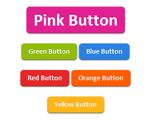
Pure CSS3 Buttons
This time we are sharing cool CSS3 buttons set.This button set contains buttons of 6 different colors (pink,green,blue,red,orange and yellow) and 2 sizes (large and medium). You can add these buttons in 2 steps into your blog or Website, also the usage of the buttons are easy. You can add more colors if you know some css3. CSS3 buttons are really very use full for any blog or website cause they are load fast and does not impact on your load time. Now lets go to the the tutorial and see how to add them and use them.


The CSS3 code

.button, .button:visited {
 background-color: #222;
 display: inline-block;
 padding: 5px 10px 6px;
 color: #fff;
 text-decoration: none;
 -moz-border-radius: 6px;
 -webkit-border-radius: 6px;
 -moz-box-shadow: 0 1px 3px rgba(0,0,0,0.6);
 -webkit-box-shadow: 0 1px 3px rgba(0,0,0,0.6);
 text-shadow: 0 -1px 1px rgba(0,0,0,0.25);
 border-bottom: 1px solid rgba(0,0,0,0.25);
 position: relative;
 cursor: pointer;
 font-family: calibri;
}
.button:hover {
 background-color: #111;
 color: #fff;
}
.button:active {
 top: 1px;
}
.small.button, .small.button:visited {
 font-size: 11px
}
.button, .button:visited,
.medium.button, .medium.button:visited {
 font-size: 13px;
 font-weight: bold;
 line-height: 1;
 text-shadow: 0 -1px 1px rgba(0,0,0,0.25);
}
.medium.button, .medium.button:visited {
 font-size: 14px;
 padding: 8px 14px 9px;
}
.large.button, .large.button:visited {
 font-size: 34px;
 padding: 8px 14px 9px;
}
.pink.button, .magenta.button:visited {
 background-color: #e22092;
}
.pink.button:hover {
 background-color: #c81e82;
}
.green.button, .green.button:visited {
 background-color: #91bd09;
}
.green.button:hover {
 background-color: #749a02;
}
.red.button, .red.button:visited {
 background-color: #e62727;
}
.red.button:hover {
 background-color: #cf2525;
}
.orange.button, .orange.button:visited {
 background-color: #ff5c00;
}
.orange.button:hover {
 background-color: #d45500;
}
.blue.button, .blue.button:visited {
 background-color: #2981e4;
}
.blue.button:hover {
 background-color: #2575cf;
}
.yellow.button, .yellow.button:visited {
 background-color: #ffb515;
}
.yellow.button:hover {
 background-color: #fc9200;
}
Add above css codes in your Theme Style Section. Now you have added the styles of buttons, lets see how to use them.


Usage of these Buttons

1. Large Buttons-
<center><a href="LINK HERE" class="large button pink" >LINK TEXT HERE</a></center>
<center><a href="LINK HERE" class="large button blue" >LINK TEXT HERE</a></center>
<center><a href="LINK HERE" class="large button green" >LINK TEXT HERE</a></center>
<center><a href="LINK HERE" class="large button orange" >LINK TEXT HERE</a></center>
<center><a href="LINK HERE" class="large button red" >LINK TEXT HERE</a></center>
<center><a href="LINK HERE" class="large button yellow" >LINK TEXT HERE</a></center>
2. Medium Buttons-
<center><a href="LINK HERE" class="medium button pink" >LINK TEXT HERE</a></center>
<center><a href="LINK HERE" class="medium button blue" >LINK TEXT HERE</a></center>
<center><a href="LINK HERE" class="medium button green" >LINK TEXT HERE</a></center>
<center><a href="LINK HERE" class="medium button orange" >LINK TEXT HERE</a></center>
<center><a href="LINK HERE" class="medium button red" >LINK TEXT HERE</a></center>
<center><a href="LINK HERE" class="medium button yellow" >LINK TEXT HERE</a></center>
Replace LINK HERE with link URL
Replace LINK TEXT HERE with the text which you want to appear on the button.

Continue Reading »